Brand Identity & Marketing Collateral
Fresh has a face now.
SimPro Mobile isn't just a produce business, it's over a decade of community service with a logo to match. Founded by CEO DeAnna Butler Toombs in South Fulton, SimPro delivers non-GMO fruits, vegetables, handcrafted juices, and fresh bowls directly to the people who need them most.
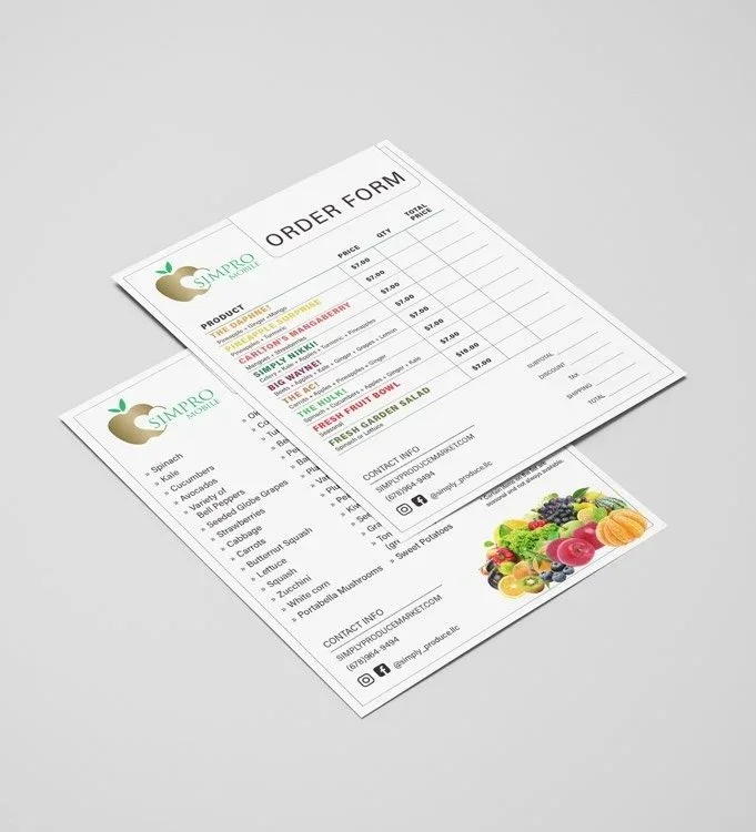
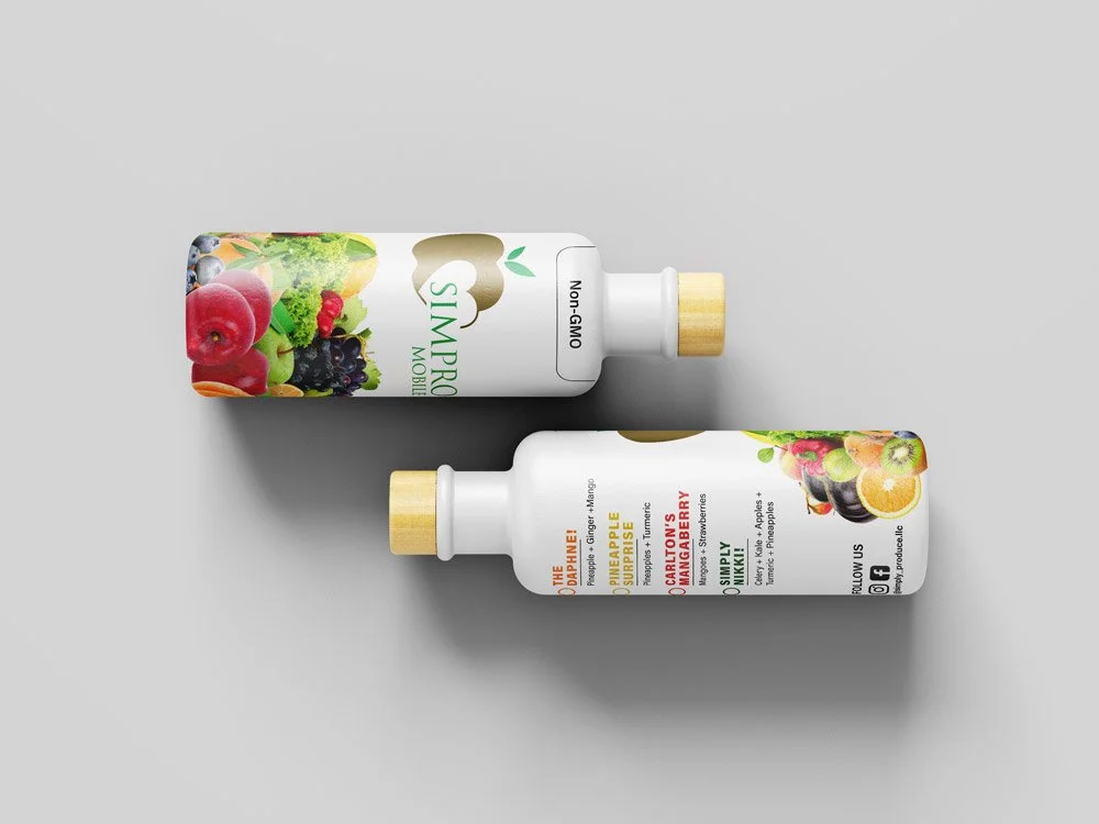
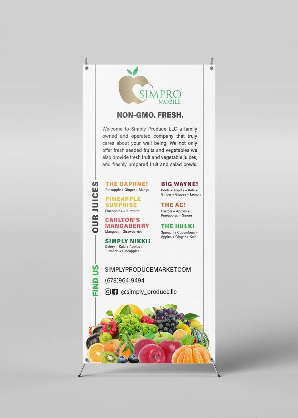
The logo came first. The gold apple mark, a nod to both nourishment and value, sits at the center of the identity, grounded by clean typography and green leaf accents that signal freshness without trying too hard. From there, the system had to flex: vibrant enough to stop someone at a market booth, organized enough to function as a working order form, and distinctive enough to stand out on a juice bottle label wrapped around a product someone's about to put in their body.
Color became the brand's most powerful tool. Each juice got its own personality: bold, named, and color-coded, making the menu feel less like a list and more like a lineup of characters worth knowing. The Daphne. Carlton's Mangaberry. The Hulk. The names had energy; the design gave them a stage.
Across the banner, rack card, flyer, and bottle labels, every piece was built around the same truth SimPro Mobile has always known: when food is fresh, honest, and made with care, it shows.